Friday, October 10, 2014

Oldest Image Revisited: Complete

Well here it is. Took forever, but here it is.
I'll correct things and update them as I come across them.
I feel like this serves sort of as a reference as to how I've progressed since I've started.
The progression in quality is obvious. 
But, I don't feel like a better artist: only a more knowledgeable one. 
Next image ETA unknown.

November 28, 2014 - Note:
I finally viewed this image for the first time using a real computer monitor.
I now understand some of the criticism I've been getting.
(I used an HDMI connected LCD TV to make the image)


Tuesday, June 17, 2014

Oldest Image Revisited: Update 2

Okay, linework is done. All that is left is the rest of the basic colors and the shading.
I reduced the tit size a little to make them more realistic. 
I still haven't added the chain to the necklace. I make note of it here in hopes that I will not forget.
This is my first real image with my new computer/monitor and I know the color is off. So if any of the colors seem off on your end just say so and I'll correct it when I can. 
I'm not sure where I stand on the sleeves. It seems like the arm on the right wouldn't even have visible sleeves. 
The arm on the left seems to be lacking a finger on the hand but I'm not sure if it's covered enough that it wouldn't be showing.
Don't know the ETA on this image. It may be done soon, it may not be.


Bondage Miku Edit & Cleanup

The original was okay, I felt inactive. I made it better.

ORIGINAL


EDITED


Friday, May 23, 2014

Gardevoir Cleaned

I was just passively cleaning this when I was bored, but after a little encouragement from my fellow funnyjunkers I decided to polish it and upload it here so I can have a new image for the first time in a while. 
Below is the before and after of what I changed.

BEFORE 


AFTER


Monday, April 7, 2014

Mizore Wallpaper

I've done it boys and girls, I've completed the image I never thought I'd get around to. 
The full-assed background image I was taking my time on. 
Then I found out about the deviantart premium membership day. 
So I kicked it into... MAXIMUM OVERDRIVE!!! 
If you crop the image right, you can make the bottom edge of the image line up with the taskbar when setting it as your background. Thus making it appear that she is peering over it.
Unfortunately, this might also be that last image I put out for quite some time. I've got a new job and the hours are almost 60 per week. Not to mention the next image in my queue isn't even close to done. 
I have two versions of this image one black and one white. Pick your favorite


Saturday, March 15, 2014

Hiding Mizore: Update 2

I wanted a new profile picture for my funnyjunk account, but I figured it would be better to just try and work on it, and maybe complete it. While it is still far away from completion it is much father along than it was in the first update. I came up with the idea that if I size the image right, I make the bottom edge of the image line up with the taskbar when setting it as my background. Thus making it appear that she is peering over it. Then the thought came to mind that I haven't made a background image of Mizore yet. So I scaled that motherfucker WAY up. I corrected many of the scaling imperfections, but there are still some. I'll correct them as I go. I don't know how long till I'll finish this, but I'll move it to the top of my queue if people want me to.


And how it looks as a background.


(yes thats my desktop)

Friday, March 14, 2014

Gwen the Great Pole Dancer

A request from Dim432.
 Gwen was alot easier to make than I anticipated. This I probably the biggest and most detailed image I've ever completed entirely in one sitting. 
(I have a really short attention span)
 I'll try to get any images left in my queue done ASAP because I'm going to be returning to work soon. I can change the background easily upon request, I just used an image from the internet to fill it in. Just ask.


Monday, March 10, 2014

Railgun POV: Complete

I was going to live steam the making of this image... but fuck it.
I'm fairly tired at the time of finishing it. If anything looks wrong, just tell me and I'll correct it. 
The skin from the original image was almost too low resolution to use, I had to touch it up and blur it almost everywhere. The image does feel like it's missing something though.
I would have gotten rid of those ugly sandals if my friend hadn't insisted on me keeping them.
I'll make a version where she is having intercourse (using this image) if enough people want it.


Friday, March 7, 2014

Railgun POV: Update 2

 I'm lazy. I haven't done anything for a while. 
I'll try to get this image done in the next week.
Here is whats done so far of the Railgun image.


Friday, February 14, 2014

Mizore x Kurumu: Complete

After much procrastination I've completed this image. I don't have too much to say about it. The image speaks for itself mostly anyway. I was thinking of doing some streaming of my editing. Like I would be editing anyway and you guys could just throw in your two cents while I'm doing it.


Wednesday, February 5, 2014

Lollipop

I make alot of Mizore images. And almost all of them have a lollipop in them. So I figured instead of wasting time making it over and over again, I could just make one really good one and save it to it's own separate file that I could import into any image needing a lollipop. Then just change the hue of the candy to change its flavor.

I've also made the SAI and the PSD files available for download to hopefully help others make more Mizore art. 

Enjoy!~


SAI file: lollipop.sai

PSD file: lollipop.psd

Sunday, February 2, 2014

The Logo

I've neglected to ever post about the logo, arguably one of the most important images I've ever edited.
It started when my friend Jacob and I (Jacob and Derrick J&D) made "The Crowd Favorite". It was the best image we had created up to that point, and we were afraid that someone was going to go around posting it on the internet without giving us any credit at all. So I suggested a logo we could put on all our images. He wasn't expecting much and was surprised when I showed him the first version... So we used it until I realized later on down the road that even if our logo is on the image people aren't going to be able to know where the image came from, much less who made it. So I made the second version. All was well. The third version came along when I decided the logo could use a bit cleaner look, the blog address could be added to the image separately. (I only used this on one image so far because big logos can be a little obnoxious) The fourth version I have yet to use. The "J" is changed into a "T" in order to symbolize "TwoDerrick" instead of "Jacob and Derrick". The reason for the change is because almost none of the images put on this site are made by both of us anymore (most are made solely by me), and the change would be fitting, although I will still use the J&D logo on images we both worked on. The fifth version was meant to look more artistic and less obnoxious, The idea was to use it more like a watermark than a logo but the idea was throw out because it would worsen the overall quality of the image if the watermark overlapped any part of the hentai. And while I would like credit, it's more important to me that the image look good. The last one? Well... The rest looked so colorless. And seeing as I used Sai Paintool it seemed fitting that I use the color wheel in the logo. I don't think I'll use it, but if thats the logo others wan to see thats the one I'll use.

Leave a comment and tell me which you like the best.


Oldest Image Revisited: Update 1

When I originally took on this image I thought it would be a quick job. But, after checking my folder I couldn't find the SAI file. So I basically had to start from scratch. I started on this the day after an anon requested it in a comment to the image. Then things just kept coming up, it kept getting pushed back. 
I know it's not much, but I thought I should at least post what I have done so far, considering it's been so long since it was requested. I owe at least that much.


(This is the oldest request in my queue so it should get done first, but considering that it's the farthest from being done I figured it would be better to have 2 more complete images soon rather than 3 incomplete images in the same amount of time)

Kurumu x Mizore: Update 2

This image is taking way fucking longer than I thought. 
After Christmas I just got majorly sidetracked. I didn't even want to go through the trouble of working on an image. It just seemed like all work and no reward. It didn't help that I bought GTA 5 too. After about two weeks into January I was like "fuck, I need to get this shit done" and I started occasionally working on images for like 15 minutes at a time. Averaging about 1 square centimeter of image completed a day. I reached the tipping point and started to actually start working when I ran into I problem working on the image. The eyes were fucked. And it didn't look too bad in the outline so I couldn't tell. But, once I added in the pupils, it was more than obvious. I spent hours trying to figure out the problem, tweak after tweak didn't do anything. So, I remade both eyes, reset their place, moved the nose, tiled the eyes, moved them again, re-sized one eye, and shaded them. And... well fuck it. I eventually just set it where it kinda looked okay and went to sleep. 

Railgun POV: Update 1

Over the weekend me and my friend decided that we were going to make an image together. 
After he gave me a bitching about how all my images are of Mizore we finally agreed on a character to make an image of:  
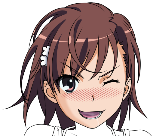
Misaka Mikoto A.K.A. Railgun from "A Certain Magical Index" and "A Certain Scientific Railgun"
I found a base image for us to work from and we divided the work; I get the head and he gets the body.
It didn't turn out too bad. I like it at least. It took probably about 4-5 hours between us. (including all the fucking around) The image shouldn't take too long to color.