Tuesday, January 8, 2019

https://twitter.com/Two_Derrick

So, I decided to start using twitter despite my hate for it.
I made this my profile picture there because twitter hates transparency.

Here is the QR code behind it. I strongly suggest not scanning it.

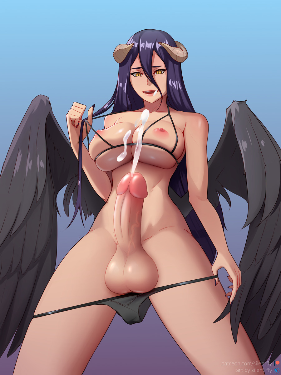
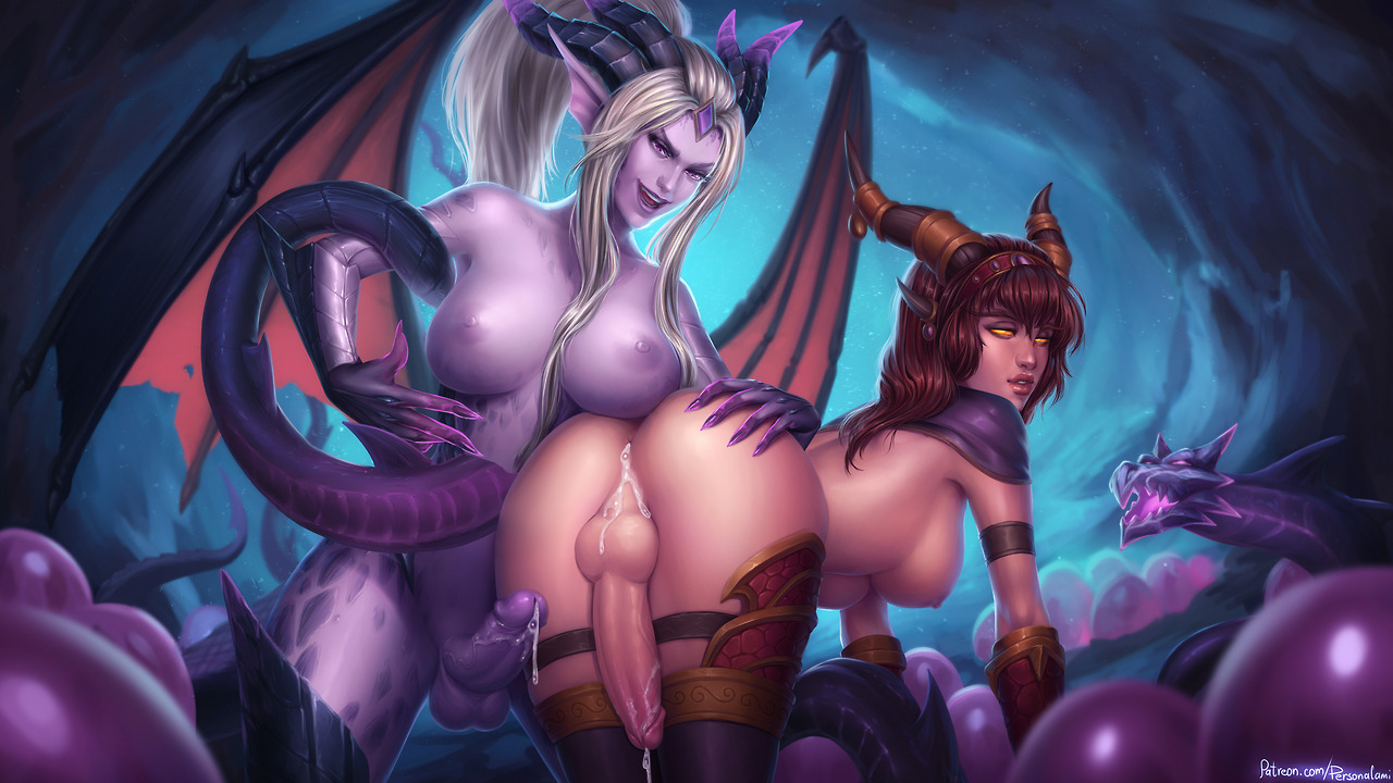
Albedo with less horses


Man, I fucking hate horse cocks. The original one of this image had a particularly nasty looking one. I put a decent amount of effort just trying to make the colors match the rest of the image, I think it turned out “ok”.
(as I'm reposting this I don't think it turned so well anymore)

Original: HERE

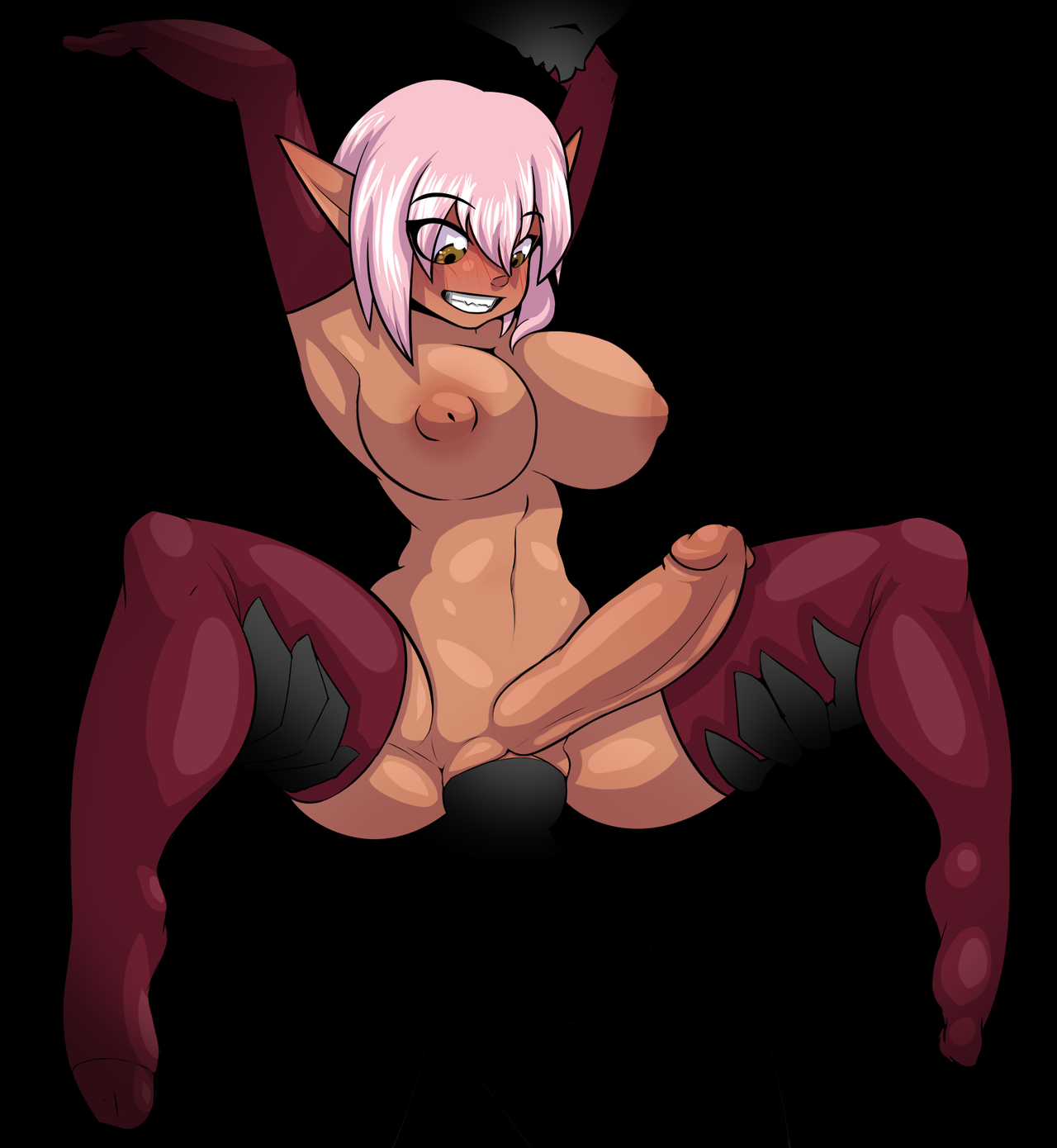
Some shitty elf edit


Removed the nipple piercings; made the ears point up instead of down; and replaced the stomach bulge with a belly button.

I was going to completely remove the thing in the background, but instead I went for a more obscured look out of laziness. 

Fuck Tumblr


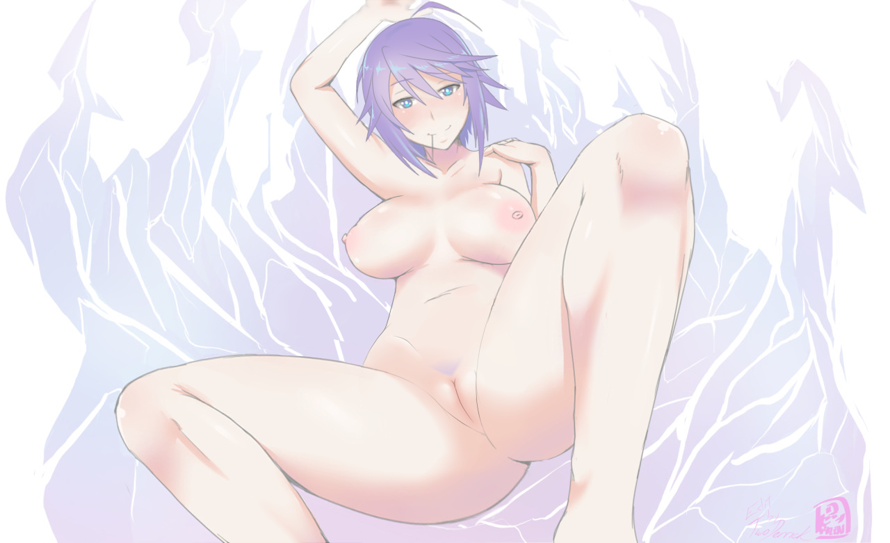
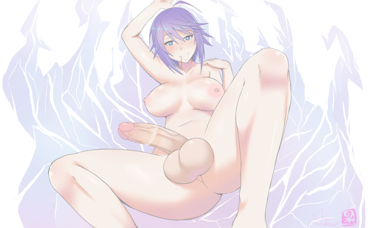
I saw the original image of this and thought “That’s barely even recognizable as Mizore.” So, I did alot to it to make it more to my tastes:

First and foremost, I made the hair into it’s more recognizable form. I changed the eye shapes to match Mizore’s. I thinned the legs some so they’d appear less fat. I adjusted some of the body proportions, with the length of legs and the size of the head being among the most notable, I did slightly blur the arm at the top to give it a sense of perspective even if only a little because the arm would be way to short otherwise. (Speaking of which, I love using the blur tools in Photoshop but I do 99% of my editing in Sai; is there a way to copy things to my clipboard from Photoshop while maintaining the transparency of the thing copied?) I was going to change the mouth but settled for just making the smile alot less cartoon like. The non-futa versions of this image were an after thought that I decided to make because it wouldn’t take too much work. Because of that, the background of the area where the dick use to be is a little… bad… also the hip bone kinda sticks out a bit much. This edit took 4 days in all, which is not bad considering 37 hours during those four days I was at my job. 

No effort applied


A “joke” request I took serious. I turned an owl man into a manly woman.

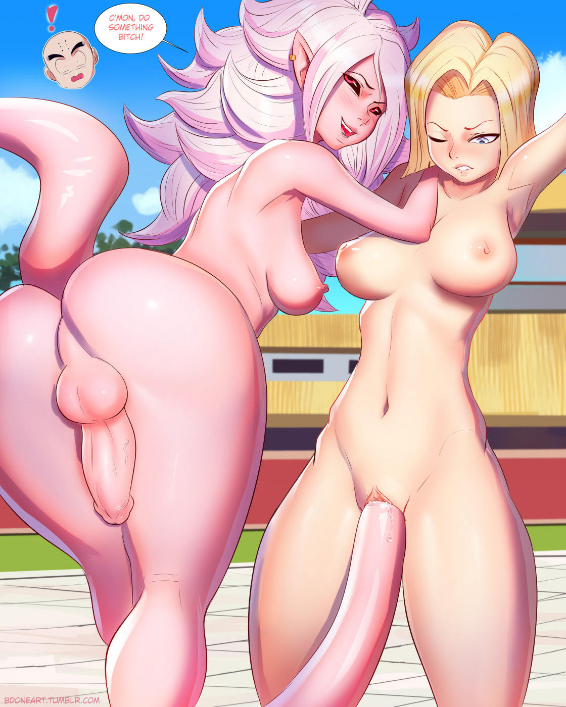
Majin 21 futa


Fixed the torso thickness and boob sag on 21; gave the boobs on 18 more curve. Also, I adjusted 21′s eyebrow to give off less of an angry look.

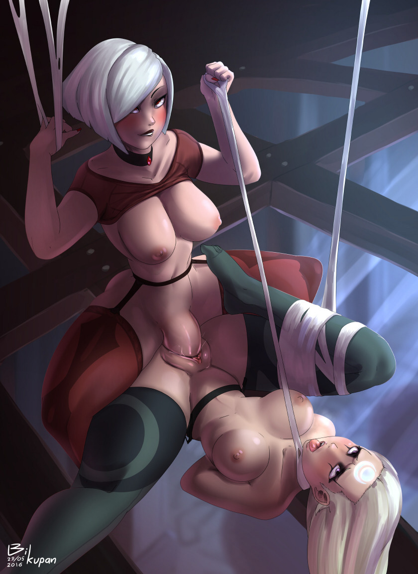
RIP Source - thebikupan


Three other versions of this image exist, all with some form of belly bulge. I didn’t like the way it looked so I took it upon myself to make (IMO) a definitive best version. I also tried to fix the part where it looks like the cock bends a bit too far. Now it looks like it just bends.


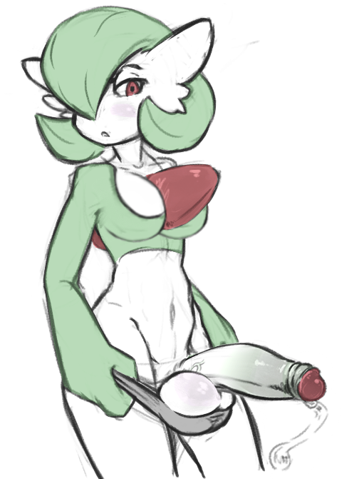
Male Gardevoir


Added some boobs; made the dick less monstrous; changed the eye’s expression; cleaned up alot of the sketch marks; and cropped the canvas size to fit the image better.

Source:

(Fun fact, tumblr didn't flag this image after the porn nuke.)

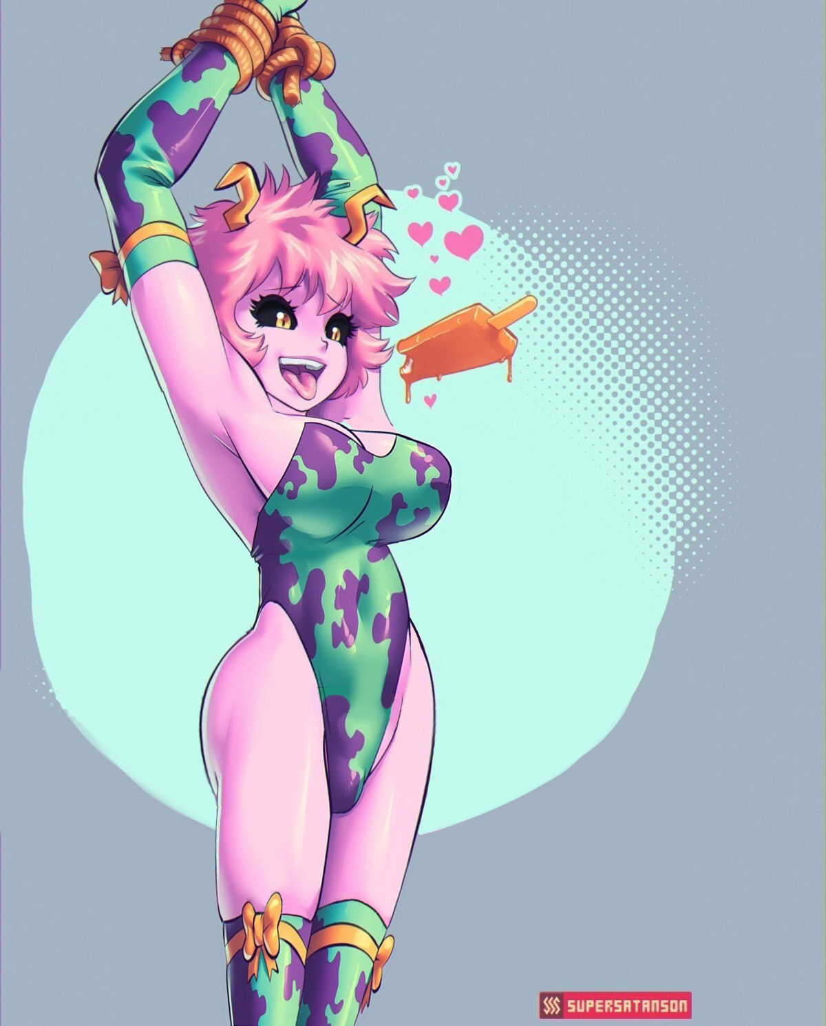
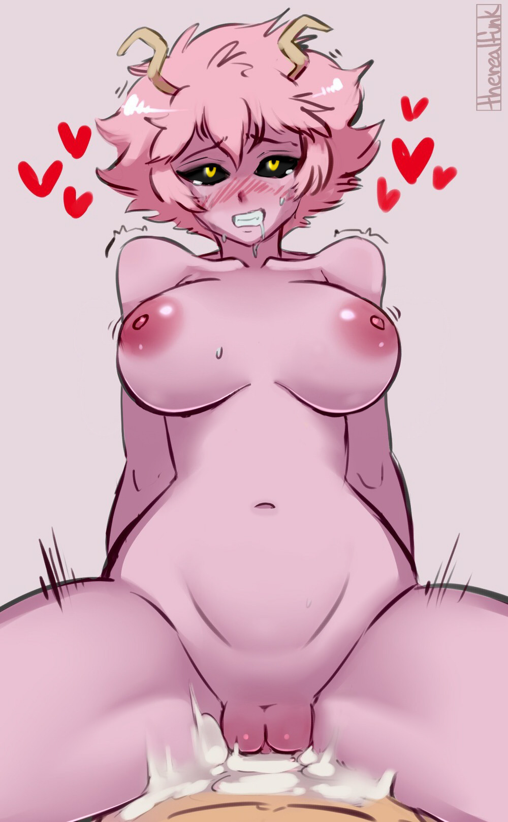
3rd Mina Ashido Edit


I’m not into BBW so I made it a little more vanilla. 

The arms are still kinda long tho.

Source is in the image cause I don't know where the original link is.

2nd Mina Ashido Edit

This summary is not available. Please click here to view the post.

Quick edit 2


Just a quick edit to normalize the size of the dick, I also uncensored it and removed some moon runes.

Original:

First Mina Ashido Edit


I changed the breast shape and changed the eyes almost entirely. I blurred alot of the rough edges and added moonlighting to others. This is an edit of funnyjunk user hakujin’s edit. The original images can be found here


https://funnyjunk.com/nsfw/channel/OneForAllHentai/If+i+m+pregnant+you+re+dead/vXGtLiK/

The over produced edit


Just trying to get the tentacle thing so that it wasn’t covering the ass any turned out to be a much bigger undertaking than I anticipated. The amount of varying hues and tones on the cheek made it so that there was no perfect gradient that could be duplicated and placed over the dragon headed tentacle. So, I just copied the skin around it and kinda just stretched it over. Unfortunately, I left the tentacle looking like it’s been cut off. If this image wasn’t such a pain in the ass to edit I’d make it look better, that being said, I don’t want to waste any more time on this cause I feel this was not worth it.

Original:

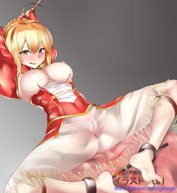
The Saber that wasn't worth the time.


This image had a lot of unnecessary text and shit on it that in my opinion detracted away from the image. So, I got rid of most of it. The almost entirety of the work i did on this image was done fixing the spots where there was text or other bullshit, I did uncensor the vag though. I left the bottom right text mostly intact because the G is actually hiding a really poorly drawn toe. And before you compare this to the original and say oh you put no effort into this, know that it fucking wasn’t easy. There was alot of guesswork.

Original Image:

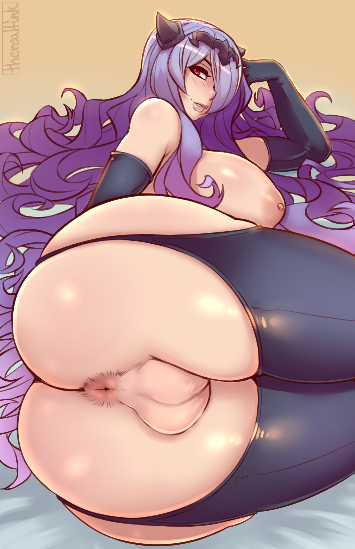
Camilla simple edit


Browsing a edit thread on /d/ someone asked to turn her vagina into balls, so I put very limited effort into this and “presto” it’s done. 

Original image can be found here:

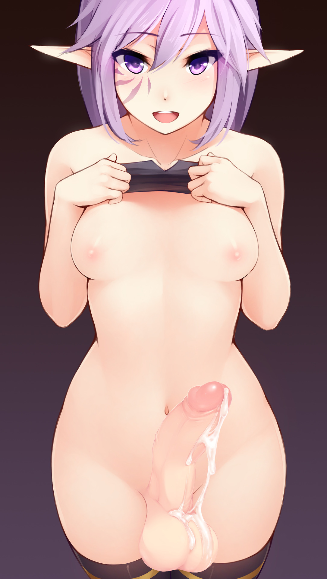
The /d/ first edit


This one isn’t entirely by me first off, someone else added the dick first, from this image. I was browsing an edit thread on /d/ and someone made the original edited version of this image. But, the amount of effort put into it was fairly minimal and i took it upon myself to improve it. I changed the shape of the balls, the skin tone of the dick, and the cum. No big changes, the reason I’m sharing this is because it’s a fairly nice image even if the dick almost looks like it’s coming out of her upper leg. 

Linking the thread I saw the edit in as a source would be stupid and I can’t find the original version, so I’ll just link the website of the original artist: Ricegnat. 

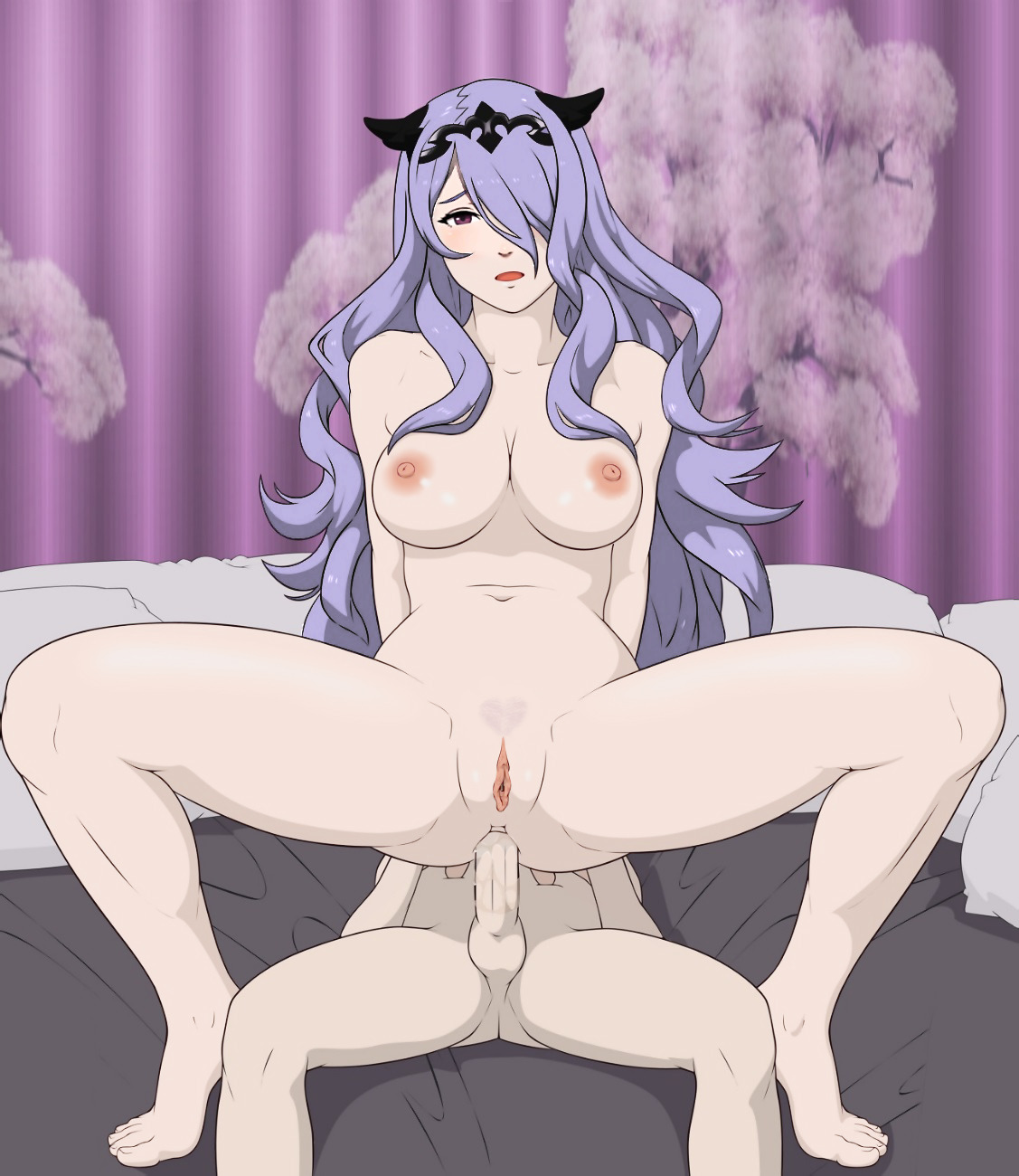
Camilla anal


I changed the skin and hair tone to be more true to her character, softened the area around the nipples, lightened the color of the pubes and also shaped them, added some light reflect to the thighs so they didn’t look so plain. I also changed the eye and eyebrow, giving her a bit more expression and making her eye look a bit more like the character’s. I still personally think the mouth looks a bit off, but I don’t know what to do with it besides making it darker, and it didn’t look that good so i didn’t keep it. I tried removing some of the artifacts in the image by using smart blur in photoshop but it didn’t really do too much. The first thing I actually changed about the image was the vagina, I made it less meaty looking by thinning it to almost a point at the top and then thinning it a bit overall.

Original image can be found at:

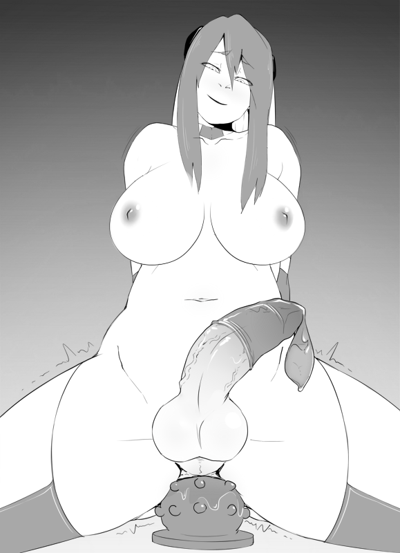
Khexxi tumblr source is kill


Just a quick edit to make the boobs look less saggy, I made them a bit bigger to fit the frame as well. I took out a tiny bit of detail around the dick area because it looked a little over done, and I removed some lines that kind of looked like something on the skin, but with the complete lack of color it’s hard to say what it was without knowing the character. (I also changed the mouth.)

Original image can be found here:

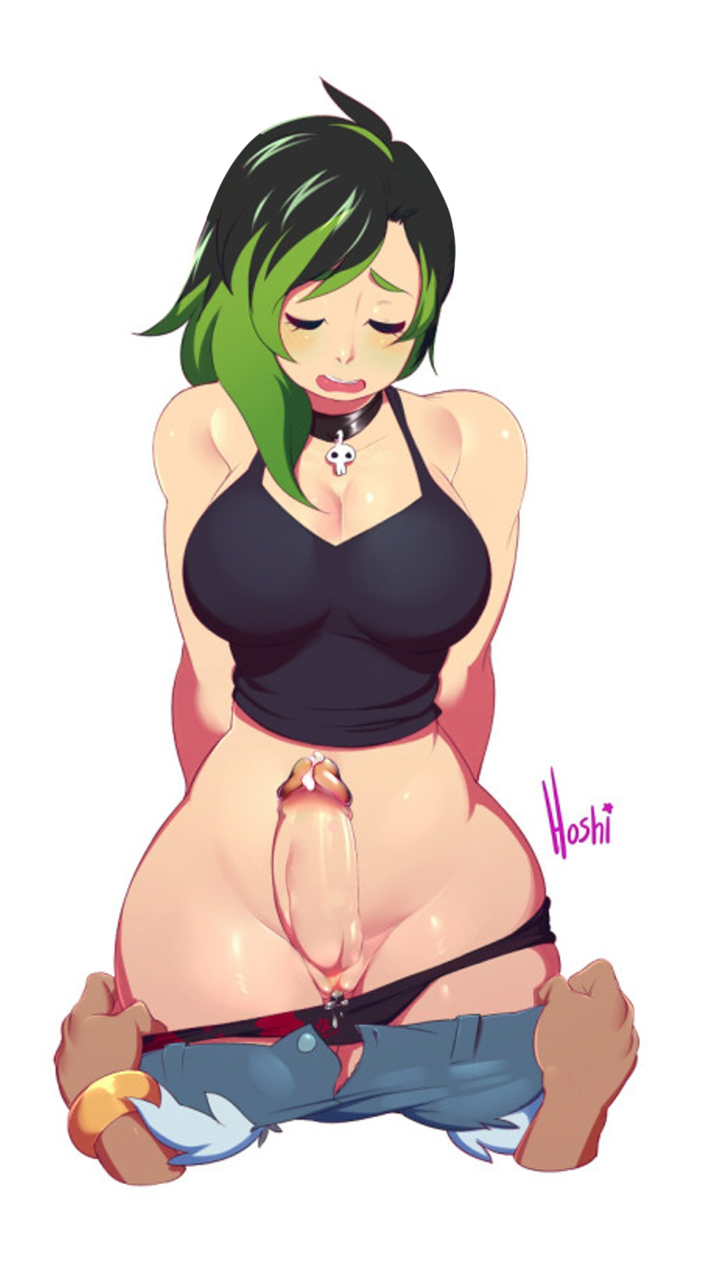
Big titty goth g....bf


Sorry about the terrible image quality firstly, it was already shit when i started on it and I couldn’t be fucked to find the better version

I made some “normalizing” edits to this. I removed the dick piercings and the collar bone piercings; made the dick red tipped instead of green tipped; made the blush red(er) instead of green; and removed the pierced mouse ears originally on the image. I’d put more work into this if I had found the better resolution version. But I didn’t.

Original version can be found here:

Low effort edit number one

This summary is not available. Please click here to view the post.

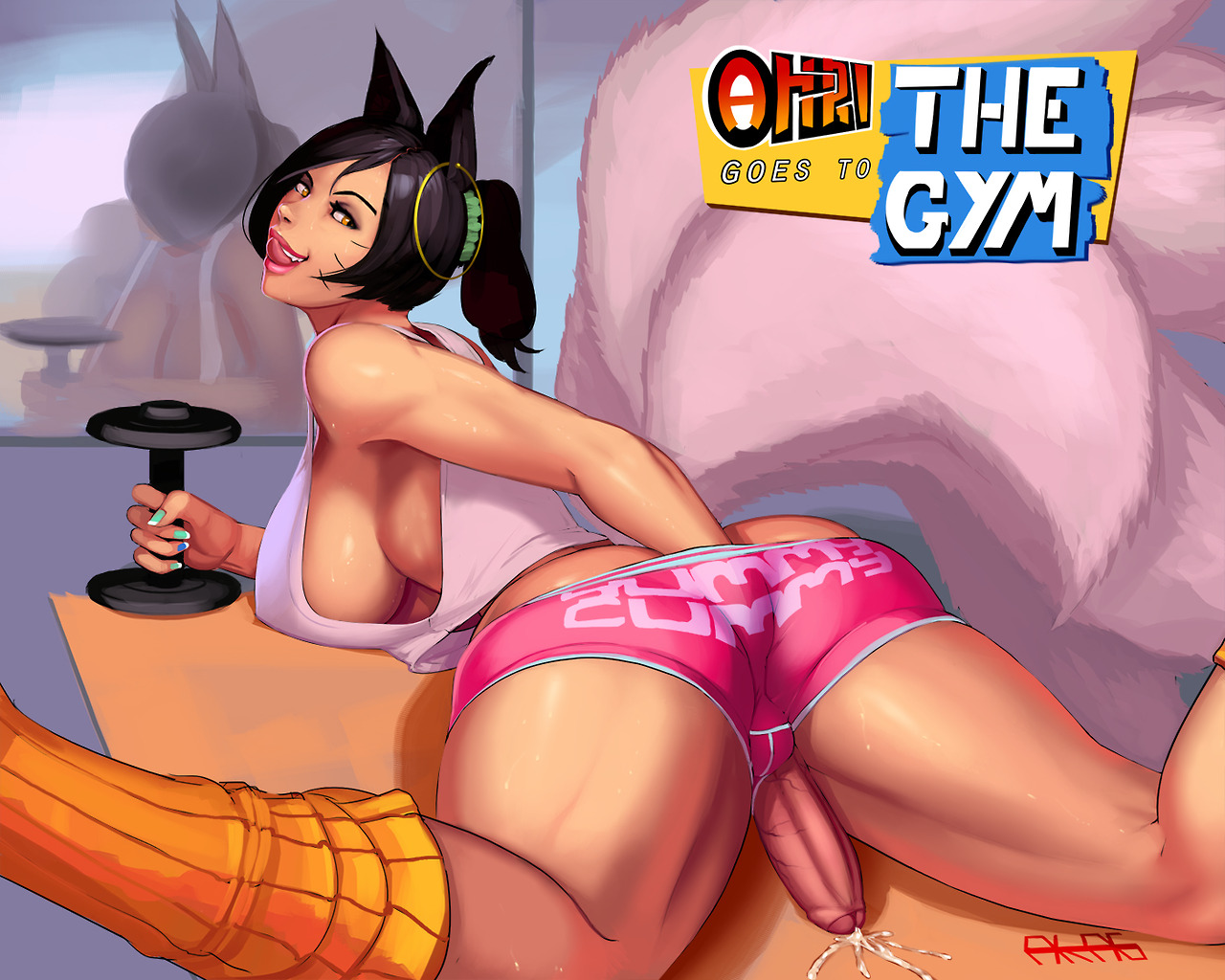
Ahri goes to the gym


I fixed the eye placement so it didn’t look like her face was so elongated.


Other than than I made the ears a bit shorter so they look a bit more cute, and I smoothed the skin out so it doesn’t look like it’s made of paint.


Original can be found here:


Moving to twitter

Image result for awakened stellaris factories

I'm going to move all my tumblr content to here instead of posting it on my twitter.
@Two_Derrick
I'll be posting everything I do there and only posting major edits here afterwards.

Tuesday, March 20, 2018

The finished obsession


I’ve been sitting on this image for a while. I first started working on it back in 2014 for some context. I had the image done for the past month and was just waiting to look at it again with fresh eyes to see if I missed anything that needed fixing. 

There is so much actual man hours put into this image that I could write a small novel about the process of making it. On overview, I’ll make the statement that I wanted this image to be as good as possible and I wanted to spend as much time as it would take to make it that good. I hope the end result is worth it.

I could make other versions of this image with changes like the mouth being more like the original, and the skin tones being slightly different, but there are so many layers and small possible changes that the SAI file for this image is about 491MB. The provided version is the one I believe to be the best of all possible worlds.

This image was originally from the Lewdevil 3 Doujin but I’ve altered just about every aspect of it enough that I don’t feel bad about putting my signature on it.

The full size of this image is suppose to be a massive 2400 x 3598. So if you’re not saving it at that size you’re doing it wrong.

Fullsize version:

Here is the original image for some perspective. 

Friday, January 6, 2017

Colorize of Young Patrick Stewart

I know this isn't the usual thing I edit but I'll post it cause why not.

Original

Colored

Sunday, August 14, 2016

Futa Arachne

I realized there were no good futa images of Arachne, so I made this edit.
I was holding onto this image for about a month, so that way I could look at it again with fresh eyes, but then I forgot everything that still needed to be done to it. 


Original Image: Here

Friday, March 25, 2016

Mizore Spitroast: All Versions Available


 MasouEsperOnward came to me with this request and I hereby deem it completed. I've been working on this for about 4 months. Partly because I wanted to make sure everything looked good, and partly because I'm a lazy asshole. Working on this image really helped my hone my skills with image editing. I learned several techniques of getting good that I previously did not know.
I've made many different versions of this image so hopefully everyone can find a version they like. The file names of each image explain everything in the image with the format of:

(Amount of Cum) (Eye Pupil Shape) (Dick Size) w (Blur Type) & (Panties and/or Stockings) & (Balls).PNG


Original

Clean Basic


Most Hearts Hung with Full Blush & Stockings & Balls

The reason I flipped the image horizontally was so that the reference image I used for Mizore's hair would line up better. You might also notice that the edited versions are a few pixels taller, that is because I realized if I made a futanari or dickgirl version then there wouldn't be enough room. But, there also would not be enough room for the stockings to even be visible. I tried to make extensive use of 2 tone shading on the lines and the hair. I think it turned out pretty fucking good. 

All the version are available here:

Mirror:

If either of the links stops working, leave a comment and I'll fix it.
If you have a suggestion as to a nice place online I can upload all of these, please inform me.

Friday, October 16, 2015

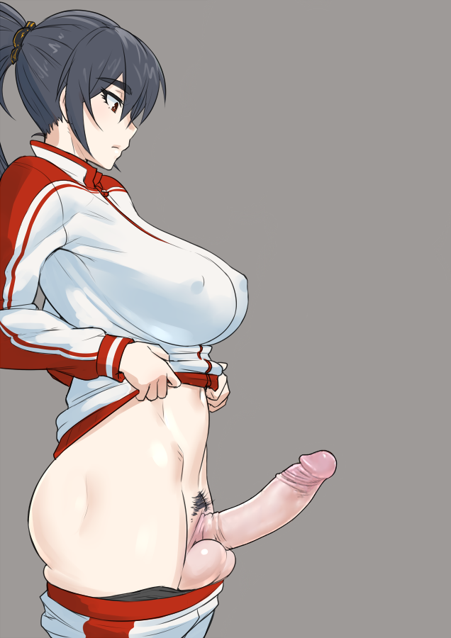
Sweater Futa

I saw this image after reading a doujin.
(I don't know the source it's been like a year)
I really liked it, but it could use improvement.
I'm not done with this one yet. Expect an update sooner or later.

Original

Current (Not Final)

Hasty Edit: Bikini Removal

I was only doing a quick edit of this a while ago.
It's nothing special.
It's not done, but I don't plan to work on it anymore.
So I'm posting it.


Arcade Miss Fortune Futa

Only changed the breast size, before this they were really really really big.
I also smoothed out some things. 


Franken Fran

A friend of mine gave me an image and told me to turn it into Franken Fran.
This is the Result.
I forgot the stitches on the neck.
Point some things out in the comments if you see something else thats wrong.


De-Censor for /h/

I was in a de-sensor thread on 4chan and OP didn't want to do this one because it was too much work. I thought "oh I could do that one real fast no prob" but then there were prob. It ended up taking me like 3 hours cause I looked for references from the original artist to make it look natural. 
(the fingernails still look off in my opinion)


High Res Eye

Well going along with testing out the transparency feature I also created this.
It's just a high resolution version of Mizore's eye.
I created it so I could just scale it down to paste over if I'm editing an image to turn it into her.
It would have been more useful if I had left out the glare in the eye, so that way I could mirror it.
But I don't have the SAI file anymore.


Rare Pepe

This was my attempt at creating a higher resolution Pepe.
This was originally a quick test to try out the full liscense version of Sai Paint Tool.
You will notice this version has transparency.
Enjoy.


Mizore Blowjob: Toms2435 Edit

Well let me hit you with a story.
Once upon a time someone donated 1 dollar to me through this blog.
The only dollar I ever got, but I never actually expected to get anything.
I did it cause it was something suggested to me when I was making the blog.
I sent the guy/girl an e-mail explaining that I was grateful and I'd share with them an image I had never shown anyone else.
 Here is that image.
I'm only posting it now cause I've never gotten a response and believe that they have not gotten the e-mail at all. 

This image is only half of the original image Toms2435 made because I was too lazy to finish the other side. Even though Toms2435 was gracious enough to give me a PSD file. Sorry 'bout that.
It's been a long time since I've worked on this, I don't remember all the changes.
Find the original and compare it if you care to.